dimecres, 23 de juny del 2010

Itinerary MAP

©Text i fotos: Àngel Gené i Ramis; traducció a l'anglès: Montserrat Casanovas i Stobart; suport informàtic: Martí Gené i Ramis


19. Can Forteza Rei and "L'Àguila" stores: Modernism during the 20th century.

©Text i fotos: Àngel Gené i Ramis; traducció a l'anglès: Montserrat Casanovas i Stobart; suport informàtic: Martí Gené i Ramis


Author:
The silversmith Lluís Forteza Rei.
Period and style:
Early 20th century; Modernism.

Formal analysis (description):
The facade shows the influence of Gaudí (similar to La Roqueta) and it favours the vegetal decorative motifs as well as fantasy beings in stone.
It shows a superficial modernism on the facade although other elements such as the entrance, the arches or the stairs confirm its status as a modernist work.


Author of the Aguila Stores:
Gaspar Bennàzar.
Period and Style:
1908, Modernism
Formal analysis (description):
- Iron holders on the first three floors with a large glass surface.
- Ornamental white and green pottery, following the Art Nouveau features.

- Iron banisters with stylized vegetal motifs.
- Vegetal decorative motifs on both sides of the last floor, which remind us of the railway bridge made by Bennàzar in Palma.

Commentary:
It seems that Bennàzar was not comfortable with the use of vegetal motifs, they are significant but short. The building seems part of a geometric scheme, characteristic of the Viennese art, especially if we consider that the arch of the facade seems inspired by Oto Wagner’s metro of Vienna.

18. The "Teatre Principal": waiting for the innovations of the twentieth century.


©Text i fotos: Àngel Gené i Ramis; traducció a l'anglès: Montserrat Casanovas i Stobart; suport informàtic: Martí Gené i Ramis


Author:
Antoni Sureda (Theater), John Guasp (pediment)
Period and style:
1858 (theatre) 1895 (pediment)
Formal analysis (description):
Classical facade (following the classical Tuscan, Ionic and Corinthian orders in the columns). Functionally it has nothing to do with the interior, an inconsistency repeated on the entrance. The main entrance is on one side, not at the central body under the pediments.
The interior has a great charm. It follows the kind of design in form of a horseshoe typical of the European theaters at the time (such as “La Fenice” in Venice or the “Liceu” in Barcelona.)
Commentary:
It seems that iron was used in the structure but it was covered, disguised (feature typical of the 19th century)

17. Anglada Camarassa, the school of Pollença and Dionís Bennàssar: the painting during the 20th century in Mallorca.

©Text i fotos: Àngel Gené i Ramis; traducció a l'anglès: Montserrat Casanovas i Stobart; suport informàtic: Martí Gené i Ramis

(pintorescatalanes.blogspot.com)

Hermenegild Anglada Camarassa (Barcelona 1871 - Pollença 1959) is a international famous painter. He was trained in Barcelona and from 1897 he was in touch with post impressionism in Paris.
His main features are symbolism, plain colours, simplifications, attraction for morbid issues, expression of the inner world and own moods, and use of prototypical evil women.
Other of his features are : loose brushwork, use of pure colours, perspective and chiaroscuro (typical impressionist characteristics) but also some restraint and austerity in his compositions, and some geometric shapes in the design of essential forms.
He started to live in Mallorca towards 1914. He left in 1936 and returned in 1948. In 1967, he created his own museum in Port of Pollença, from which his works were transferred to the Cultural Centre of La Caixa in 1988.
(quaderns.balearweb.net_violinscançódelesaguiles_1944)

Dionís Bennàssar (Mallorca 1905-1967) and the school of Pollença.
A great number of painters were influenced by the works of Anglada Camarassa, his students, while he was in Paris. Some of them will even follow him to Mallorca, such as Tito Cittadini, who had an great influence on the training of Dionís. All of them belonged to the so-called "school of Pollença". Bennàssar has also contacts with Russinyol or Mir (also painters from the "Colla del safrà", Gang of the Saffron, because of their intense use of the yellow colour.)
(www.museudionisbennassar.com_plçadepollença_1933)


During a first moment, 1926-1940, he was a scholar and academic, however, he changed, during 1940-50, expressing a much more modernist side following the steps of Anglada. During 1950-67, he became more personal in his paintings
(www.revistadearte.com_la-gata-rosa_1908)

There was an important movement of painters from all around the world who came to Mallorca and influenced the flow of intellectuals and tourists on the island. They will foster modernity and they will stimulate the appearance of important local painters, such as Bennasar or Antoni Gelabert. This bohemian atmosphere of intellectuals and foreign artists was brilliantly portrayed by Llorenç Villalonga in his novels.
(www.epdlp.com/cuadro.php?id=26)

(www.liceus.com_sibilla_1913)


(www.esbaluard.org_pideformentor_1922)


( www.epdlp.com/cuadro.php?id=8)


16. The Grand Hotel: the first years of the 20th century.

©Text i fotos: Àngel Gené i Ramis; traducció a l'anglès: Montserrat Casanovas i Stobart; suport informàtic: Martí Gené i Ramis


Author:
Lluís Domenech i Montaner
Period and style:
1901-1903, Modernism
Historical context:
- Growing tourism (wealthy tourists).
- Money concentration in fewer hands (since 1880 different people tend to gather to create corporations, which will found large companies and factories)
- Moderate Industrialization.
- Cultural contacts with Catalonia and Valencia (common interests, they follow the principles of the "Arts and crafts", for the revitalization of the techniques of medieval pottery)

Formal analysis (description) and commentary:
The facade shows that we are in front of a modernist work (first full modernist work in Mallorca). The "revival" elements dominate over the "Art Nouveau". If we compare it with Can Cassasayas, we have:
-Traditional semiround and round arches.
-Innovative organic motifs at the top, where there is a pediment of classical inspiration.

-A dynamic undulating facade combined with a plain facade, reminiscent of medieval times.
However, it is undoubtedly a modernist work because:
- Its use of new materials.
- Freedom in the design of the empty spaces on the ground floor thanks to the use of iron.
- Use of structural elements as decorative motifs.
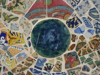
- Pottery use on the last floor ("La Roqueta", related to the importance the "Arts and Crafts" movement gave to pottery)

- Importance to the details.
- The combination of industry at the front (iron, pottery) together with the craftwork (sculptured stone, wrought iron)

"La Roqueta" (a pottery factory founded in 1887 in Palma)
It was an attempt to join industry and crafts following the precepts of the "Arts and Crafts" and Art Nouveau movements. The use of ceramics and pottery in architecture was more valued in the Catalan Countries than in the rest of Spain. The dragons at the Grand Hotel are a revival of a traditional form, a fantasy-inspired motif with Mesopotamian origins and often used during the middle Ages.

15- House Ques: Rationalist architecture


©Text i fotos: Àngel Gené i Ramis; traducció a l'anglès: Montserrat Casanovas i Stobart; suport informàtic: Martí Gené i Ramis


In the early 1930s, began to notice in Mallorca influences of architecture linked to the modern, rationalist architecture. So many buildings were built this house as Ques. Rationalist ideas about architecture is already beginning to enter in Majorca in 1928 with articles published by the writer Villalonga and architecture student Francesc Casas in the newspaper El Dia. It presents the main ideas of Le Corbusier, ideas that are the basis of rationalist architecture. Casas and other mallorquins architects formed in Barcelona knew where the Catalan rationalist group activities, very active. So in some ways what happened with the rationalist architecture is analogous to what happens with modernist architecture: it develops from the influences of Barcelona, That tells us that, in addition to what we talked previously, the island treballassin rationalist architects of the Principality, as Monravà Casas Lamolla or Mestres. Work rationalists shutters were many more that a significant level, of which tells us this magnificent façade Ques.

The building is designed by the architect Enric Juncosa, the year 1932. The facade is predominantly horizontal, horizontal gaps to govern well-defined windows, which follows the trends advocated by Le Corbusier and rationalist architecture. No doubt this is possible thanks to a concrete structure that underpinned leaves open the facade of its function supported, so you can make any opening. So the light comes more freely inside the building. Some pairs of columns to the last floor, we illustrate this innovation structural concrete based.
On the large horizontal cantilever we have two semi-circular eaves that provide a truly modern air in the attic when it is finished off with the building.
Yet this building reveals a still hesitant rationalism, limited by several things such as use of the interior walls, too deep edification, rear facade with openings that do not match the floor ... Hesitation can be resolved should be referred to later in other works, but the Civil War (1936-1939) strontium these trials Majorcan architecture to join the modern movement.
Rationalist ideas about architecture began to be introduced to Mallorca about articles published by Villalonga and Francesc Casas in 1928. Rationalist architecture will begin to develop under the influence of the Principality, in the 1930s, numerous works and a more than significant level as this.

-Author: Enric Juncosa
-Vintage-style: 1932, Rationalist
-Analysis-formal dominance of the horizontal rectangle windows also, thanks to a concrete structure that releases the front of the function based. The columns are the penultimate floor in a sample. The semi-circular eaves of the attic air give it a truly modern.
-Comment: rationalism still hesitant because of:
Using the interior walls
Excessive deep edification
Rear openings that do not correspond with the plant

14. Can Casasayes and the Menorcan Pension: Modernism at the beginning of the 20th century.


©Text i fotos: Àngel Gené i Ramis; traducció a l'anglès: Montserrat Casanovas i Stobart; suport informàtic: Martí Gené i Ramis

Among other things Modernism meant:
1. Creation of a new architectural language, although sometimes there are revivals of past forms.
2. Use of new materials such as iron, concrete or glass.
3. Profuse decorations with natural motifs (animals - skeletons with stylized bones and tendons - plants, and other symbols), especially at the facades
4. Use of structural elements for decoration.
5. Creativity and freedom in the design (unusual shapes, asymmetries,...)
6. Appraisal of traditional trades and use of them to make the decorative motifs of the facade (iron, ceramics, stone sculpture, glass, wood, etc.)
7. Careful design of the inside of the houses as a whole, as a system.
8. Dynamism in the design: flowing forms, sinuous lines and "whip strokes".
Modernism came late to Mallorca with the construction of the Grand Hotel. If it started in Europe around 1890, it will not start in Mallorca until the twentieth century.

Author:
Francesc Roca

Period and Style:
1908-11, Modernism.
Formal analysis of the facades (description)
Undulating forms inspired by the Islamic art. These forms are set like palm leaves and they are complemented with vegetal motifs: all together give the image of the growth of leaves as they unfold, a very characteristic symbol of the Art Nouveau.
Expressive columns, some of iron (industry), some of stone (craftwork). Formally identical, they both play a dialectical game as if saying "I am worth as much as you". It is a game that implies the use of new materials as well as traditional ones. They embody the expression "industry, yes, but also crafts".

Balcony irons in form of butterfly wings, coloured glasses and wrought iron like spiderwebs show that the building follows the purest spirit of the Art Nouveau, perhaps more intensely than the Grand Hotel.
Commentary:
The whole architectonic compound is adapted to its surroundings, to the winding streets and the old medieval market (unlike Jaume III).

13. Jaume III and the destruction of the medieval design during the twentieth century.

©Text i fotos: Àngel Gené i Ramis; traducció a l'anglès: Montserrat Casanovas i Stobart; suport informàtic: Martí Gené i Ramis


The facades of the houses in Jaume III Street have certain charm and character.


Maybe it is a good place to go shopping. However we can say some negative things about it:
1. As we have seen, it is a fake pattern as regards the medieval pattern. The new buildings and their height are good proof that they are not from the Gothic period.
2. Many blocks of houses of Gothic origins were destroyed to draw it.
3. It is absurd that it tries to imitate styles and forms from the past when it precisely destroyed authentic medieval works.
Similar designs were vetoed when the historic centre was declared as "Historic Preservation" in 1964.

12. Can Ribera Street and Jaume III: the first serious "esventramentos" of the twentieth century.


©Text i fotos: Àngel Gené i Ramis; traducció a l'anglès: Montserrat Casanovas i Stobart; suport informàtic: Martí Gené i Ramis


First, we have to explain what "Esventramento" means. It is the destruction of blocks of houses in a urban environment, usually to draw a new street.

Around the 1930s, Gustavo Giovannoni declared himself against the destruction of houses and he laid the ground for the future assessing of the Palma monuments such as the historical winding streets. However, the City Hall of Palma undertook some repairs in 1950 aimed to improve the Gothic Catalan part of the city.

Giovannoni's proposals were accepted by the Unesco, European Community, etc.. One of these reforms was the new street of Jaime III, which ignored the medieval design and the surrounding streets, blocking them with its houses.
Can Ribera shows the former beauty of the old city and evidences the ugly scheme of Jaume III.

11. Can Weyler and Pau street.

©Text i fotos: Àngel Gené i Ramis; traducció a l'anglès: Montserrat Casanovas i Stobart; suport informàtic: Martí Gené i Ramis


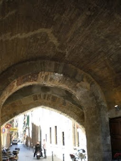
Again we have to talk about the charm of the winding and maze- like little streets

Author:
Unknown

Formal analysis of the facade (description):
It follows the archetypical scheme of a private Catalan Gothic mansion with its characteristic elements:
- Round arched gate (Romanesque art heritage)
- Horizontal mouldings (a feature in opposition to the Gothic verticality, linked to the influence of classical architecture which came from Italy).
- Two floors of double windows called "coronelles" (word derived from the Italian "Columnella") with little round arches (also Romanesque heritage).

Commentary:
Interior with patio (Baroque alterations).
Curious Gothic design on the first floor (ballroom) discovered in the late nineties of the 20th century: it has a thee-section plane with two lines of pointed arches dividing each section (they are perpendicular to the direction of the nave). It is the only Gothic mansion of Palma that has kept this design.

10. Gate of Bab Al Modi, Es Born and the entertainment during the 20th century.


©Text i fotos: Àngel Gené i Ramis; traducció a l'anglès: Montserrat Casanovas i Stobart; suport informàtic: Martí Gené i Ramis


Gate of the Islamic city wall, corresponding to an extension of the old Caliphate city during the eleventh and twelfth centuries, the only section remaining of this extension.
On the Right: the facades of the Apuntadors street, which follow the route of the disappeared wall. The street already existed in the 11th century; it was constructed parallel to the city walls.
The name refers to the people who packed the large production of wool in Mallorca. During the middle Ages, Mallorca, through the Mediterranean trade, became famous due to its exportations of wool all around the world. These people sewed ("apuntaven") the canvas around the wool, to avoid that they got ruined during the long journeys.
The tradition of producing fabrics could be associated with its industry, which had a great development in Mallorca at the end of the nineteenth century, beginning of the 20th.

The width of Born street, prolonged with Union Street and La Rambla, is noteworthy because it is surrounded by narrow streets of medieval origin. The explanation of its uncommon width can be found in Sa Riera, the stream that runs across Palma. Sa Riera used to end in a small beach which now is the Born. However, at the 16th century the stream was changed in course and made it run along the moat of the Renaissance walls.

In the middle Ages, knight competitions were done in the Born and during mid-twentieth century it was the centre of entertainment par excellence of the city.

9. The Cathedral stairs, Saint Domingo and the destruction of our cultural heritage during the nineteenth and twentieth centuries.

©Text i fotos: Àngel Gené i Ramis; traducció a l'anglès: Montserrat Casanovas i Stobart; suport informàtic: Martí Gené i Ramis


Stairs like this one next to the Cathedral connected the upper part (“Canamunt”) to the lower part of Palma (“Canavall”).
On the right, we can see the convent of Santo Domingo (thirteenth and fourteenth centuries), the most beautiful Mallorcan Gothic convent. Unfortunately, it disappeared in 1835 under the demagogy of the 19th - century progressivism and because the inquisitors had been Dominicans.

We call it demagogy because once the convent was fallen down the land became object of a major real estate speculation (as they were large pieces of land in the city centre). It created a dangerous precedent for many speculative operations that will take during the twentieth century.
With Santo Domingo many fragments of the old Roman wall, the Jewish quarters, and the wall of the 10th-century caliphate also disappeared. Parts of the Cathedral and the Almudaina Palace also disappeared.
A Medieval narrow and winding street next to the Royal Palace was replaced with a small square and a broader street.
On the left, we can see the Islamic wall of the Almudaina Palace.

8. Cort Square, the Town Hall and some events of the twentieth century

©Text i fotos: Àngel Gené i Ramis; traducció a l'anglès: Montserrat Casanovas i Stobart; suport informàtic: Martí Gené i Ramis


This large square is called Cort, because the Mallorcan courts of justice were placed here, exactly at the same building which is now the Town Hall.

Author of the facade of the Town Hall:
Gabriel Torres (author of the eaves), inspired by the Atlantis on the cathedral’s pulpit by Juan Salas.

Period and Style:
17th century. Renaissance and Mannerism
Formal analysis (description):
Facade with curved pediment and wide eaves supported by anthropomorphic figures.

Commentary
From the 13th century onwards this building was the headquarters of the "Gran i General Consell", entrusted with the island government in matters such as finance, public works, culture, health care, defense or economy.

In 1715, after Mallorca was conquered by the Castilian and French troops of Felipe V, the Consell was removed and its functions were taken by the Castilian Council and the new City Hall, which will follow the model of the Castilian city halls. The new City Hall will be placed in the same building of the former Consell.

Thanks to Josep M. Quadrado in the late nineteenth century, the facade wasn't transformed or destroyed as it was planned.
Many important events of the Mallorcan history during the 20th century happened precisely in Cort.

7. Santa Eulalia Square: cabbages, bread, noodles, parsley, the fishmonger's and the butchers from the Middle Ages, seen from the point of view of the

©Text i fotos: Àngel Gené i Ramis; traducció a l'anglès: Montserrat Casanovas i Stobart; suport informàtic: Martí Gené i Ramis


After the Catalonian conquest, this Square became an important market, above all of vegetables, that's why in the nineteenth century it was still called as "The cabbages Square"

The church of Santa Eulalia is the dominant element, and next to it some of the streets names indicate what was sold here: the Bread, Noodles, Parsley, Fish and Meat streets. Many of this kind of markets had already disappeared in the early twentieth century, they moved to the new and nearby Plaça Major (Main Square). The main tendency of the moment was to concentrate all the markets in one place to improve the sanitary conditions.

6. The Arch of the Almudaina Palace and the archaeologists of the twentieth century.

©Text i fotos: Àngel Gené i Ramis; traducció a l'anglès: Montserrat Casanovas i Stobart; suport informàtic: Martí Gené i Ramis


One of the gates of the Roman wall, the only one that is left from the 5th century, was also used by the Islamic and Catalonian conquerors. We have already seen some fragments in the Episcopal Palace gardens and at Morey Street.

The ashlars at the top are from the Muslim domination while the cantilevers are from the Gothic period.


We can observe the thickness of the wall from the threshold; it is around two metres thick, and some of the holes in which a cylindrical piece was placed to allow the ancient door to be moved.


On the right side we can see a good stretch of Roman wall with one of its towers fixed to it.
During the second half of the twentieth century, archaeological research confirmed that the gate was one of the entrances to the Roman city (until then, it was believed that it had Islamic origins).

5. Ca n'Olesa: archetypical image for the twentieth-century tourism.

©Text i fotos: Àngel Gené i Ramis; traducció a l'anglès: Montserrat Casanovas i Stobart; suport informàtic: Martí Gené i Ramis

Author:
Unknown (first floor windows decorations seem inspired by the work of Juan Salas in the choir of the Cathedral.

Period and style:
14th and 15th centuries (Gothic remnants) 16th (facade, Renaissance), 17th century (patio, Baroque)
Formal analysis (descriptions):
Mansion from the city of Palma with its typical features: Main door with round arch., Baroque Patio and porch with eaves on the Gothic roof and little windows with ogee arches in imitation of the "Llonja", the old fish market.

It has Renaissance windows on the ground and first floors, Gothic forms on the porch with ogee arches at the top.
The spaciousness of the asymmetric patio, excessive thick columns and the three-centered arches extraordinarily low show the ostentation, arrogance, creativity and freedom of canon characteristic of the Baroque art.
Commentary:
Nearly every noble house in Palma, like this one, has Gothic origins, often as a result of joining smaller houses, with alterations from the sixteenth-century Renaissance (above all in the windows and patio).
This type of aristocratic house was defined by the novelist Llorenç Villalonga in the first third of the 20th century in his novel "Mort de Dama" (its female protagonist quickly defines this kind of house to us when she says: "Only in proper houses there is raining"). The author himself lived in a house like this one close to the Cathedral. During the Civil War, Villalonga wrote his most popular and well-known novel "Bearn".
Since the beginning of the 20th century, the patio has become the most representative touristic image of Palma (The city has been named as a "city of patis").

4. Can Morey Street.

©Text i fotos: Àngel Gené i Ramis; traducció a l'anglès: Montserrat Casanovas i Stobart; suport informàtic: Martí Gené i Ramis


The Roman wall, also used during the 10th century by the Islamic conquerors, continued parallel to Can Morey Street.

Can Morey street was situated outside the city walls until the eleventh century, when the Muslims drew a new city wall which included, apart from the Roman and Caliphate city, a new space from the outskirts, creating this way one of the largest cities of Europe in the period (perhaps the seventh after Rome, Paris, London and Cordoba).


Its irregularities in width and design are characteristics of the winding streets of the Islamic and Gothic city. These features gave these streets a special charm. Through the bars of the doorway number 14, you can see some remains of the Roman wall and one of its towers.


3. Roman wall in the gardens of the Episcopal Palace: archeological discoveries during the 20th century.

©Text i fotos: Àngel Gené i Ramis; traducció a l'anglès: Montserrat Casanovas i Stobart; suport informàtic: Martí Gené i Ramis


Until mid-twentieth century it was not possible to confirm that the setting of the current city of Palma coincided with the Roman Palma.

Around 1970, important Roman remains were discovered in the city centre such as remnants of the Roman city wall, most of them visible from the gardens of the Episcopal palace although some of them are embedded in three blocks of houses.


We can see the ruins of an ancient water-wheel, which was found next to one of the towers of the Roman wall. One of the gates of the Roman wall was destroyed three hundred years ago because religious processions weren't able to get past.

2. Mossen Alcover's house: his works on the Dictionary between 1920-21.

©Text i fotos: Àngel Gené i Ramis; traducció a l'anglès: Montserrat Casanovas i Stobart; suport informàtic: Martí Gené i Ramis
 
House of Antoni Maria Alcover (1862-1932). He was one of the founders of the Catalonian philology and dialectology.

In this house, Alcover, along with his disciple Francesc de B.Moll, compiled a large part of his dictionary about the ancient and modern Catalonian language. It was started in 1901 and finally published in 1964. His dictionary has been described as "the largest monument which could possibly have a Romance language"

His compilation of Mallorcan folk tales ("Rondalles") is also one of the most exhaustive in the world

Around the year 2000 some archeological excavations were done in his house. Remains of a monumental Roman building were found.

1. Saint Bernat Street and the "Hospitalet": Rococo and Modernism.

©Text i fotos: Àngel Gené i Ramis; traducció a l'anglès: Montserrat Casanovas i Stobart; suport informàtic: Martí Gené i Ramis


1. Saint Bernat Street and the "Hospitalet": Rococo and Modernism.

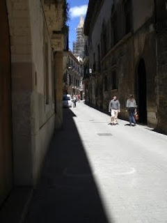
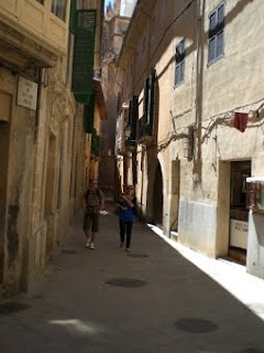
This street, and all the winding little streets from the historic centre of Palma, is a monument on itself, the largest and most important monument of the city.

Author of the "Hospitalet" of Saint Peter and Saint Bernat: Unknown.
Period and style: Mid 18th century - 1775. Mannerism of classic tendencies (facade inspired by the Episcopal Palace), Baroque (patio), Rococo (decorations from the main entrance)
Formal analysis (description): Decorative motifs from the entrance doors of the "Hospitalet": major innovations from the Rococo art are the asymmetric stone motifs with form of seashells; asymmetry and curious forms, which will be an inspiration to Modernism. Commentary: Do not mistake the Rococo (and its fascination with all the inconsequential things) for the Baroque and its transcendentalism.